Hey there, fabulous podcasters-to-be! Let’s talk about one of the most exciting and sometimes overlooked parts of starting your podcast—choosing the perfect podcast logo!
You know, your podcast logo is like the sparkling crown of your show—the first thing people see and the face of your brand. It’s what sets you apart, elevates your production value, and makes your podcast instantly recognizable. Imagine it as love at first sight for potential listeners, giving them a sneak peek into the magic you’re about to unleash!
But hey, not everyone’s a design expert, and that’s totally okay! In this post, we’ll dive into the art of selecting an eye-catching, versatile podcast logo that speaks volumes about your show, even if the design isn’t your forte. Let’s make your podcast shine like the star it is!
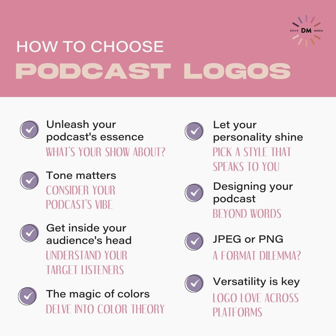
How To Choose Podcast Logos
Unleash your podcast’s essence: What’s your show about?
Before diving into the mesmerizing world of podcast logos, take a moment to ponder the heart and soul of your show. Think about its core theme, the stories you’ll share, and the emotions you’ll evoke in your listeners.
Your podcast logo should be a reflection of your unique voice and the captivating tales you’ll weave. Let your logo whisper to potential listeners, “Hey, this is what we’re all about, and it’s going to be amazing!”
Tone matters: Consider your podcast’s vibe
Every podcast has its own vibe—whether it’s hilarious, informative, heartwarming, or thrilling. Your podcast logo should set the tone right from the start. For instance, a whimsical font and playful colors might work wonders for a comedy podcast, while a clean, minimalist design would suit an educational show. Embrace your podcast’s personality, and your logo will speak volumes about the incredible experiences your listeners are in for!
Get inside your audience’s head: Understand your target listeners
Now, close your eyes and picture your ideal listener. Who are they? What do they love? Understanding your target audience is the key to crafting a logo that magnetizes their attention. Consider their interests, aesthetics, and preferences. Whether it’s a pop of pastel for millennials or bold colors for adventure-seekers, aligning your logo with your audience’s tastes will make it irresistibly magnetic!
The magic of colors: Delve into color theory
Colors are like enchanting spells that evoke emotions and feelings. Each hue carries its own mystical power—from the warmth of red to the tranquility of blue. Dive into color theory and choose a palette that aligns with your podcast’s essence and tone. Remember, a well-chosen color scheme can add a touch of magic to your logo, casting a spell on anyone who lays eyes on it!
Let your personality shine: Pick a style that speaks to you
Your podcast logo is an extension of yourself, so don’t be afraid to let your personality shine through! Whether you’re into sleek modern designs, whimsical illustrations, or classic elegance, welcome a style that truly resonates with you. When your logo reflects your authentic self, it becomes a powerful charm that attracts like-minded souls to your captivating podcast world!
Designing your podcast: Beyond words
As they say, “A picture is worth a thousand words.” And in this digital era, that saying couldn’t be more accurate! Your podcast logo is the face of your brand, representing your unique voice and one-of-a-kind vibe.
When getting your podcast logo designed, think about the theme, tone, and core message of your show. A graphic designer can be a fantastic asset, helping you translate your podcast’s essence into a captivating visual representation.
JPEG or PNG: A format dilemma?
When it comes to exporting your podcast logo, you may encounter the choice between JPEG and PNG formats. But don’t worry; it’s a simple decision! If your logo has a transparent background, go with PNG. However, if you have a solid background color, JPEG works just fine. Remember to keep your logo’s resolution high for the best quality across various platforms.
Versatility is key: Logo love across platforms
In this digital age, your podcast logo will conquer more than just Apple Podcasts and the podcasts directory. It will grace your social media profiles, your website, and even promotional materials.
Ensure your logo can be scaled, adapted, and still hold its allure across various platforms. A logo that’s as adaptable as a chameleon will keep your brand strong and recognizable wherever your listeners wander!
Best Podcast Logos
The Papaya Podcast
The Papaya Podcast’s logo is a delightful blend of creativity and authenticity. With a vibrant palette of tropical colors and a whimsical papaya illustration, it captures the essence of the show—fun, energetic, and packed with juicy conversations. This logo beckons listeners to embrace self-discovery and personal growth, just like the sweet fruit it represents.
Absolutely Not
Absolutely Not is the epitome of sass and wit, and its logo mirrors that attitude flawlessly. With bold typography and a striking color choice, it sets the stage for unapologetic and hilarious discussions. This logo is a fierce proclamation that the podcast holds nothing back and encourages listeners to join in on the bold and uproarious ride!
The Bitch Bible
The Bitch Bible’s logo oozes edgy charm and a tongue-in-cheek personality. Its daring use of typography and a dash of gold rebellion embodies the podcast’s unfiltered and audacious approach. This logo is an unabashed declaration of being unapologetically oneself, inspiring listeners to embrace their inner “bitch” with pride.
Career Contessa
Looking for an example of a logo of elegant professionalism and ambition, look no further. With clean lines and a sophisticated color scheme, The Career Contessa reflects the podcast’s focus on career growth and empowerment. This logo is an embodiment of the modern career woman, confidently climbing the ladder of success with grace and determination.
Food Heaven Podcast
With a visual feast, Food Heaven’s logo truly tantalizes the senses. With a warm color palette, it encapsulates the show’s celebration of health and nourishment. This logo invites listeners to indulge in scrumptious conversations about food, wellness, and the joys of a balanced life.
Dear Gabby
Dear Gabby’s logo is a soothing embrace, much like the podcast’s compassionate and uplifting content. With gentle pastels and a heartwarming design, it symbolizes empathy and support. This logo assures listeners that they have a safe space to seek guidance and find solace as if they are conversing with a trusted friend.
What We Said
What We Said’s logo is a striking blend of friendship and style. With a chic and trendy design, it embodies the podcast’s essence of casual and candid conversations between best friends. This logo captures the essence of girl talk and laughter, inviting listeners to join in on the relatable and enjoyable journey.
To draw in new listeners, your logo needs to perfectly embody your podcast!
Remember, your podcast logo is just one piece of the big branding puzzle. Check out our post, “What Do You Need to Start a Podcast” to get a full to-do list! But, never forget, the key to a successful podcast lies in the content you create and the connection you establish with your listeners.
So, to all the aspiring podcasters out there, don’t be afraid to unleash your creativity and design a podcast logo that reflects the soul of your show. An eye-catching podcast logo will definitely help you capture your audience’s attention and make them lifelong followers!
Happy podcasting, and remember, Dear Media is always here to support your endeavors with helpful blog posts such as these and many more.
